
John Gapper
When Apple suspended sales of iPhones and other products in Russia this week, it also made a subtler intervention. Along with Google, it turned off traffic updates for its live mapping service in Ukraine as a precaution against the invading army using it to attack.
Russia has its own satellite imagery and mapping tools, rather than relying on Apple to plan its advance. But the first external sign of the invasion came when a traffic jam caused by a military column appeared on the Ukrainian border, and was spotted on Google Maps by a professor in California. It was a visual clue in the information war.
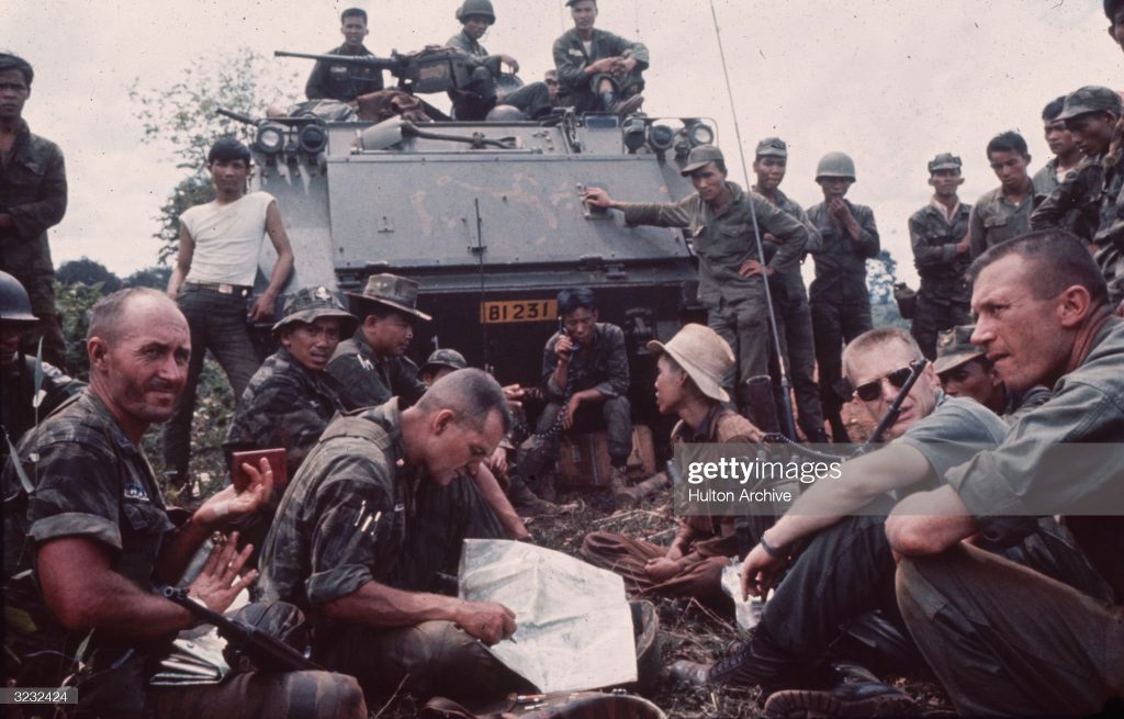
Maps are essential in wartime. Since Russia’s invasion started, there has been a constant flow of videos and photographs on social media, and front-line correspondents and camera crews provide in-depth coverage.
We cannot grasp the scale of the conflict without seeing the locations of Kyiv and Kharkiv, or how the Dnipro river crosses the country. Sometimes, things only fall fully into place in our minds when there are maps that visually display the relationships and distances among people, settlements and objects.
The zones of Russian invaders pushing towards Ukraine’s cities in the past week have exerted a dark fascination; the Financial Times’ data visualisation team constantly updates its own maps. Many maps feel personal.
It was impossible at the height of the pandemic not to be gripped by graphics showing infection rates across countries, and how high they were nearby. We look for “you are here” signs to see how close we are to destinations, or how exposed to danger.
The visual influence of data plotted on maps was illustrated powerfully elsewhere this week, with the publication of new international research into the origin of the Covid-19 outbreak in Wuhan in 2019. There have been suspicions that the virus escaped from the city’s Institute of Virology, but the studies indicated that it came from live animals in the Huanan Seafood Wholesale Market, as China said.
The maps of early cases around the Wuhan market are not definitive proof but they look convincing. They are reminiscent of the famous map of an 1854 cholera outbreak in London’s Soho, based on local infection data analysed by the physician John Snow, which helped to establish that the disease was spread by contaminated water.
But the strength of maps in conveying useful information makes them good for propaganda, too. “Give me a map, then let me see how much/Is left for me to conquer all the world,” declares the central Asian emperor Tamburlaine in Christopher Marlowe’s 16th-century play.
Mapmaking is “not a neutral objective pursuit, but one laden with power”, one paper notes. Vladimir Putin’s rambling address about the links between Russia and Ukraine on the eve of his invasion was hard to understand. Kremlin apologists quickly flourished a map of Ukraine showing zones allocated to the country by Russian tsars and Soviet communist rulers, including Nikita Krushchev.
The map’s message was clear: what Russia gave, it can also reclaim. There is a long history of nations using maps to advance their claims to imperial possession. As Mark Monmonier writes in How to Lie with Maps, grand duchies that “seemed tired, rundown and frayed at the edges” could take a piece of paper, draw a map of territory, “and presto: you were now the leader of a new sovereign, autonomous country”.
China unveiled a new map in 2014 that, instead of placing disputed islets and reefs in the South China Sea in an inset box of claimed territory, extended its scope far into the ocean by the Philippines and Vietnam. “This vertical map of China has important meaning for promoting citizens’ better understanding,” said one official.
Russian manipulation of maps has often involved concealment as well as propaganda. The Soviet Union was intensely suspicious of allowing precise geographical data to appear on its public maps, for fear of being invaded, and introduced visual distortions and blurring from the 1930s onwards: Moscow tourist maps did not show buildings such as the headquarters of the KGB.
The better news is that it is getting harder for empire builders to control the visual narrative. Enormous amounts of mapping and spatial data are now available through private providers such as Apple and Google, as well as satellite services including Maxar, Capella Space and Planet, and public databases. Open-source intelligence can paint a vivid picture.
A small but telling example is the Russian Oligarch Jets Twitter account, which tracks the private jets and helicopters owned by figures including Roman Abramovich and Oleg Deripaska, using public data from a flight enthusiasts’ site. Knowing that they make their own way around the world is one thing: observing their paths is more engaging, and enraging.
Russia’s discomfort with open intelligence may have been illustrated this week by the cyber attack that temporarily took down Liveuamap, a Ukraine-based open-source group that has collated invasion data and images from social media and other sources and linked them to maps. Although the source of the attack was unclear, aggressors often want information concealed.
So, like consumers of other forms of news and information, map readers must beware of being misled. Indeed, the psychological power of maps is so strong that the danger is greater. When a country redraws its borders and plants the new map alongside its national flag, seek a more reliable guide.